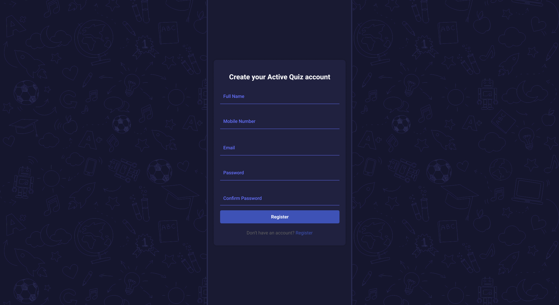

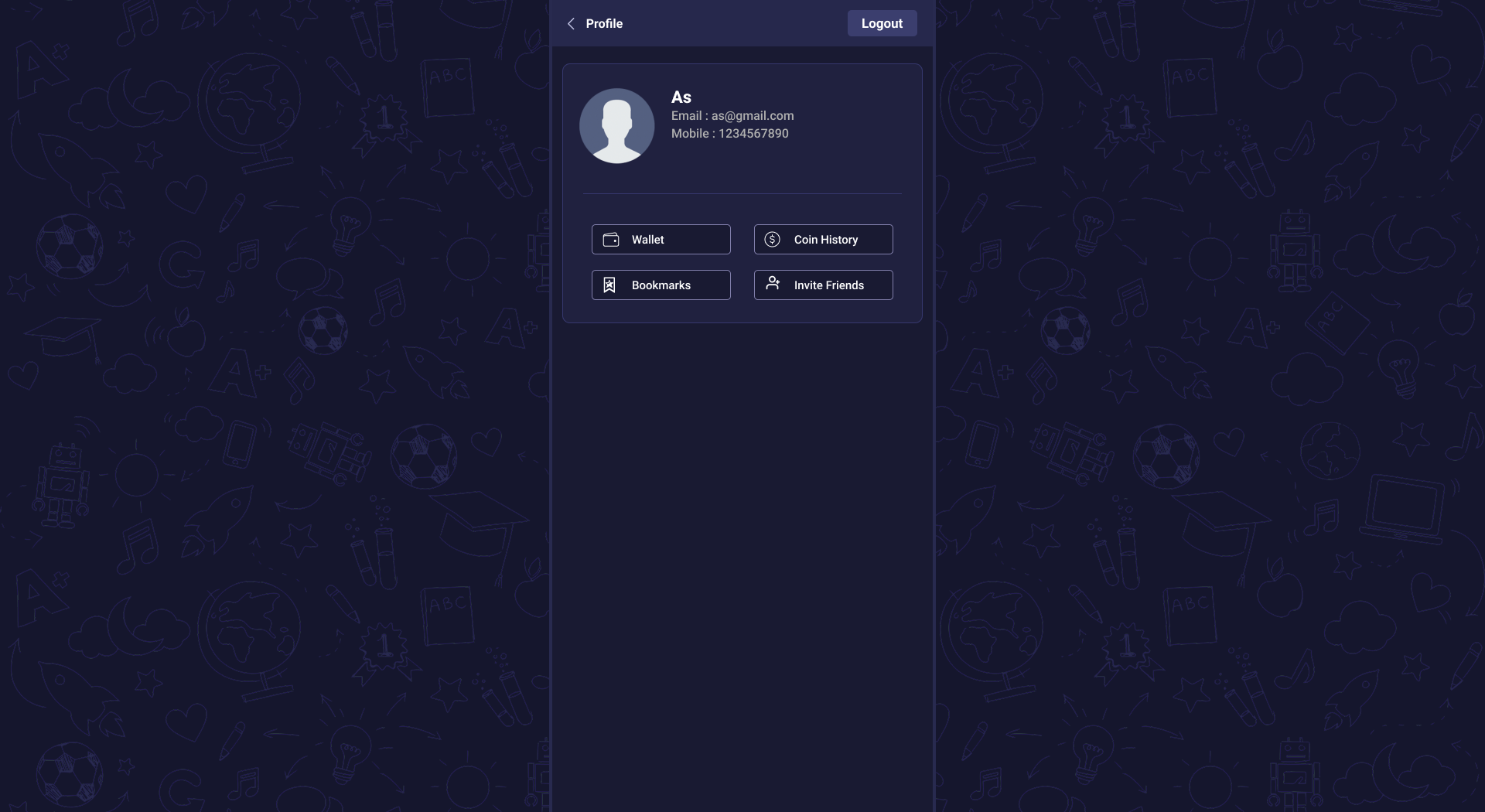

Active Quiz Admin Panel
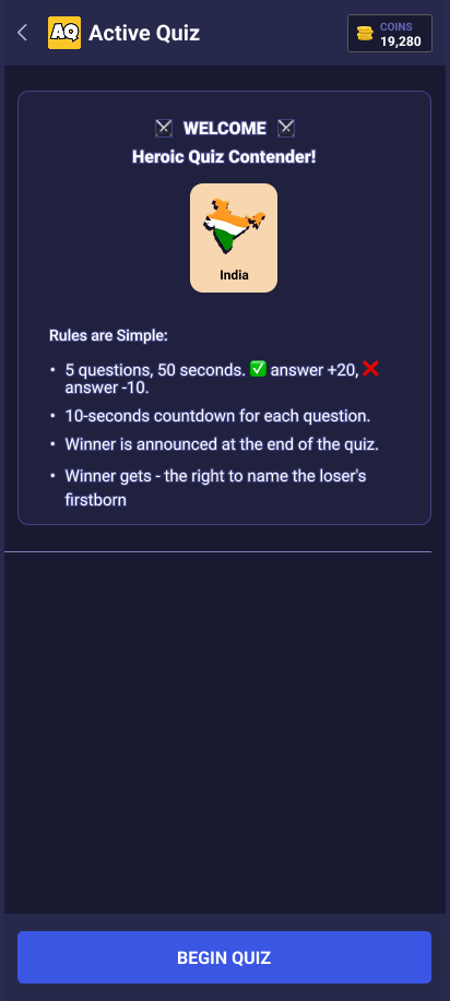
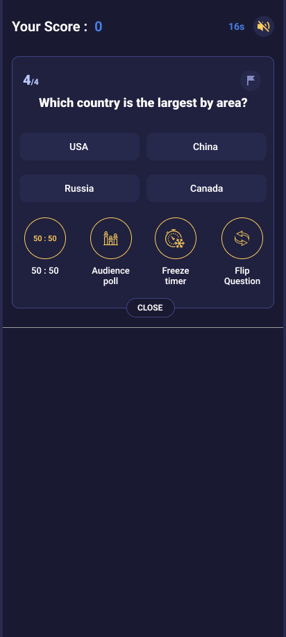
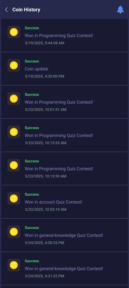
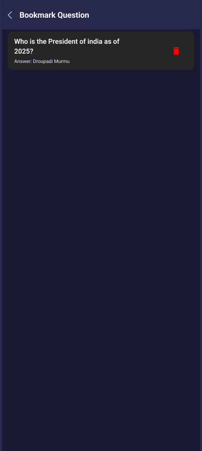
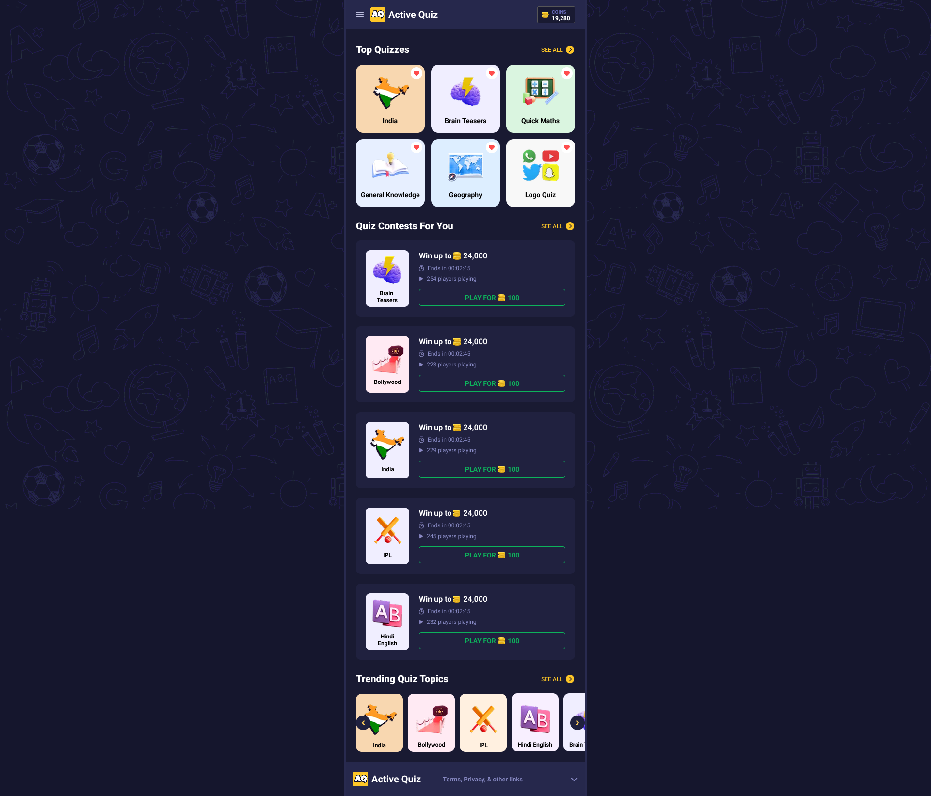
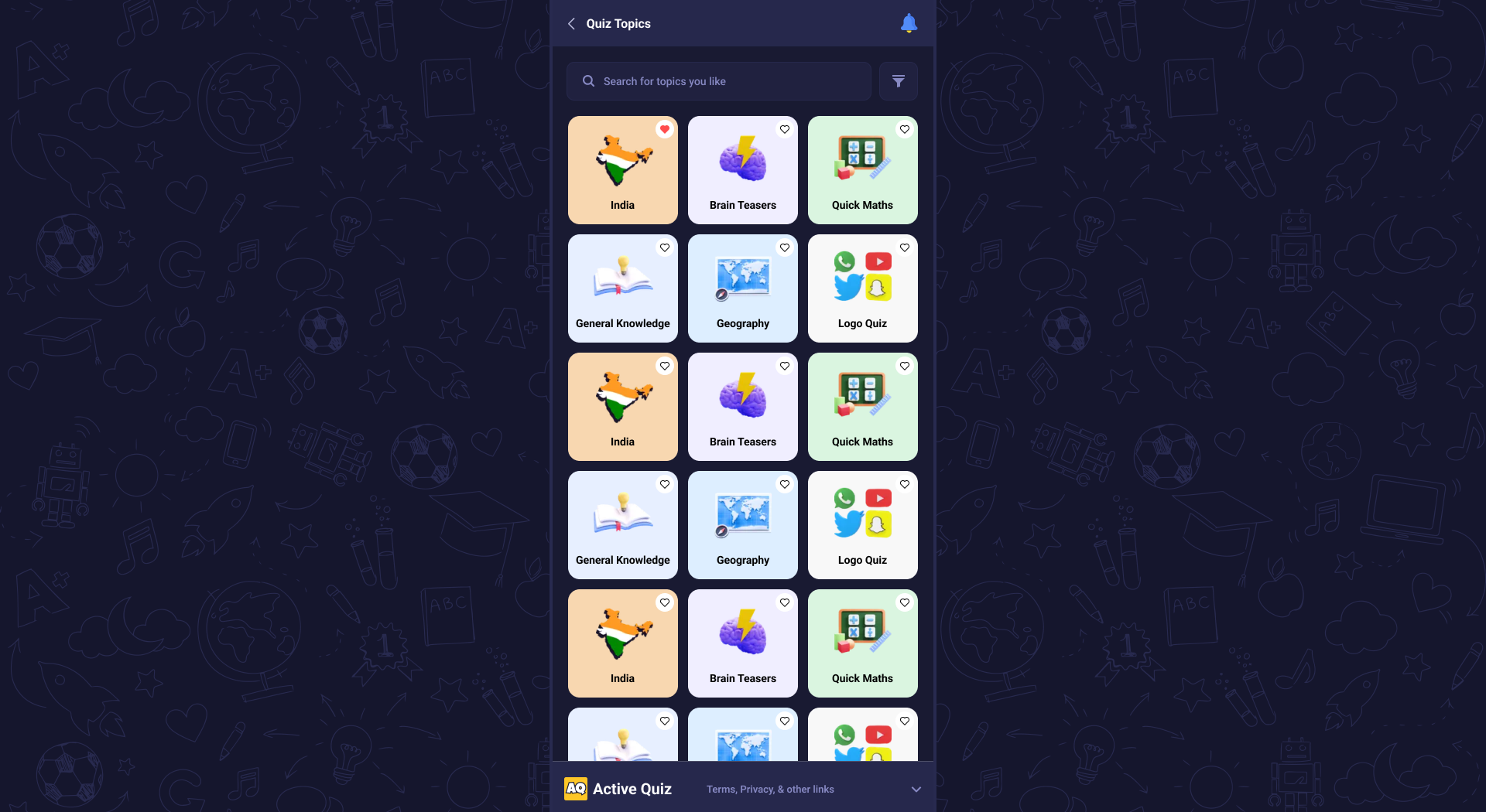
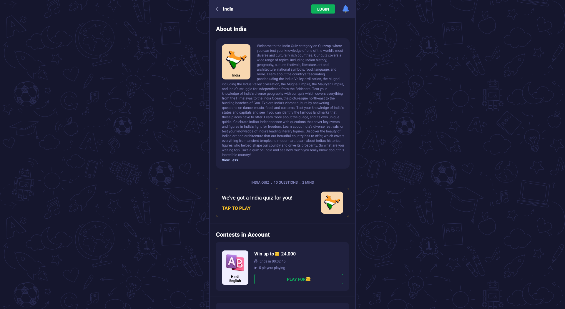
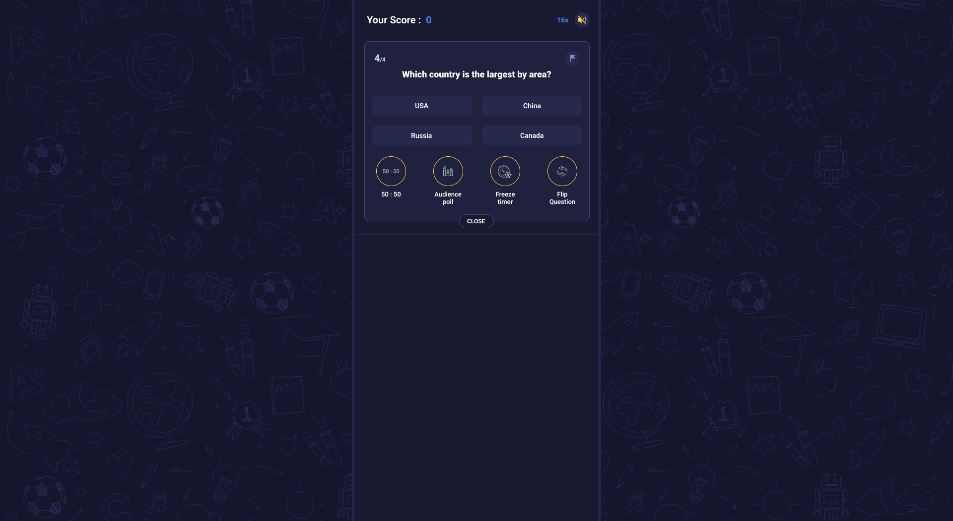
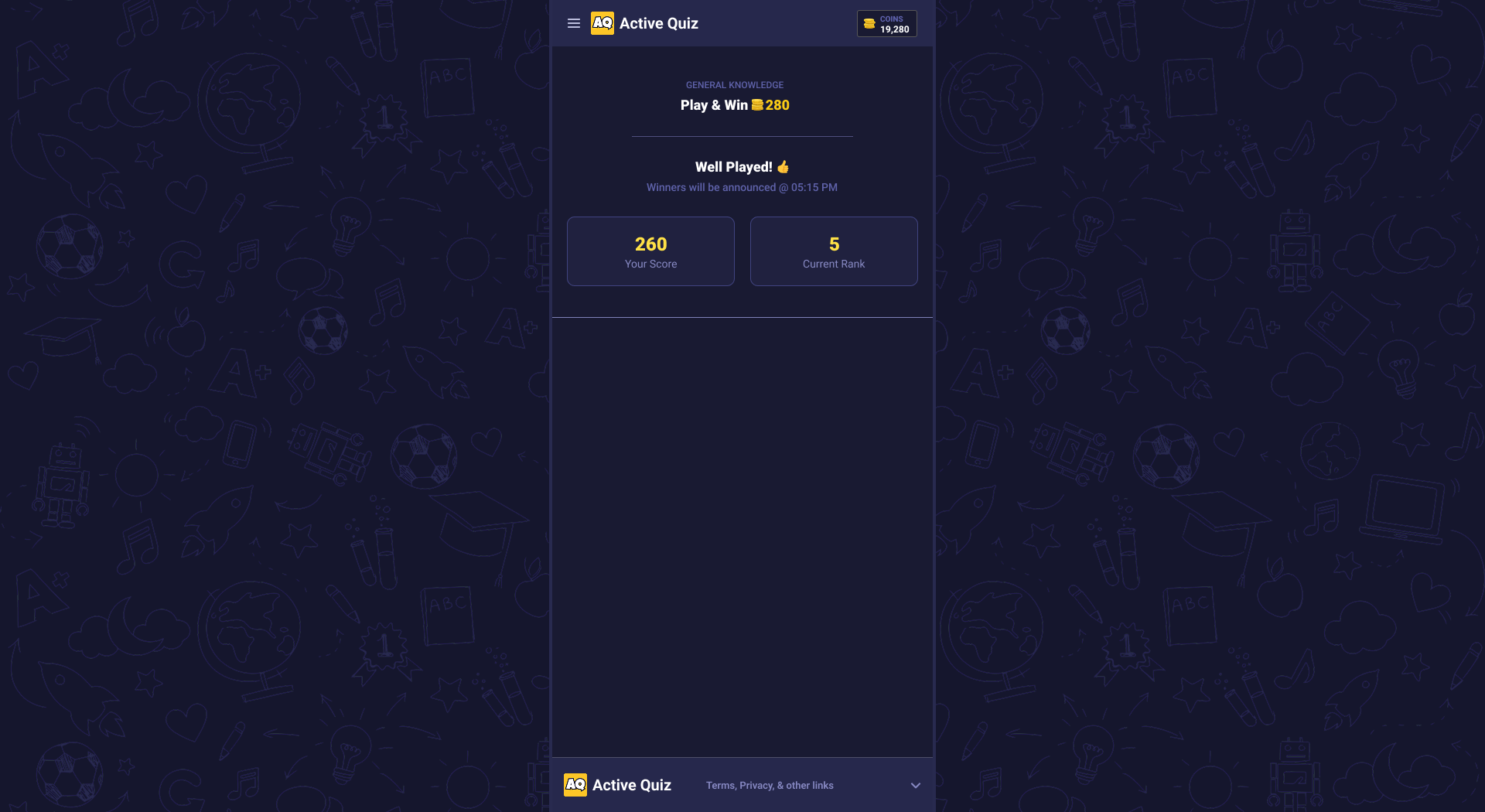
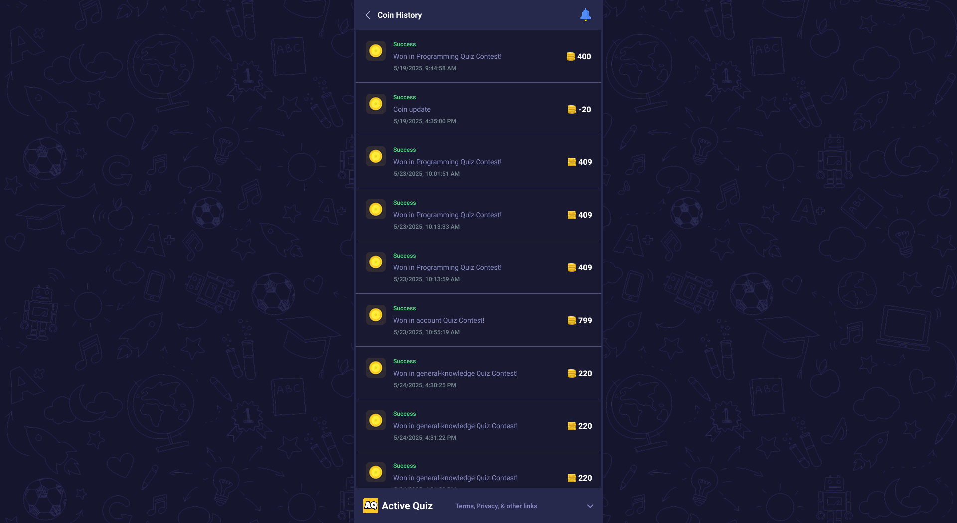
Active Quiz is an engaging and interactive platform designed for brain-storming through quizzes. With a sleek and user-friendly interface, it offers an excellent experience for users of all ages. The platform features a vast range of quiz topics, allowing users to learn and test their knowledge in different topics.
Admin Panel Login
Accessing the Admin Panel
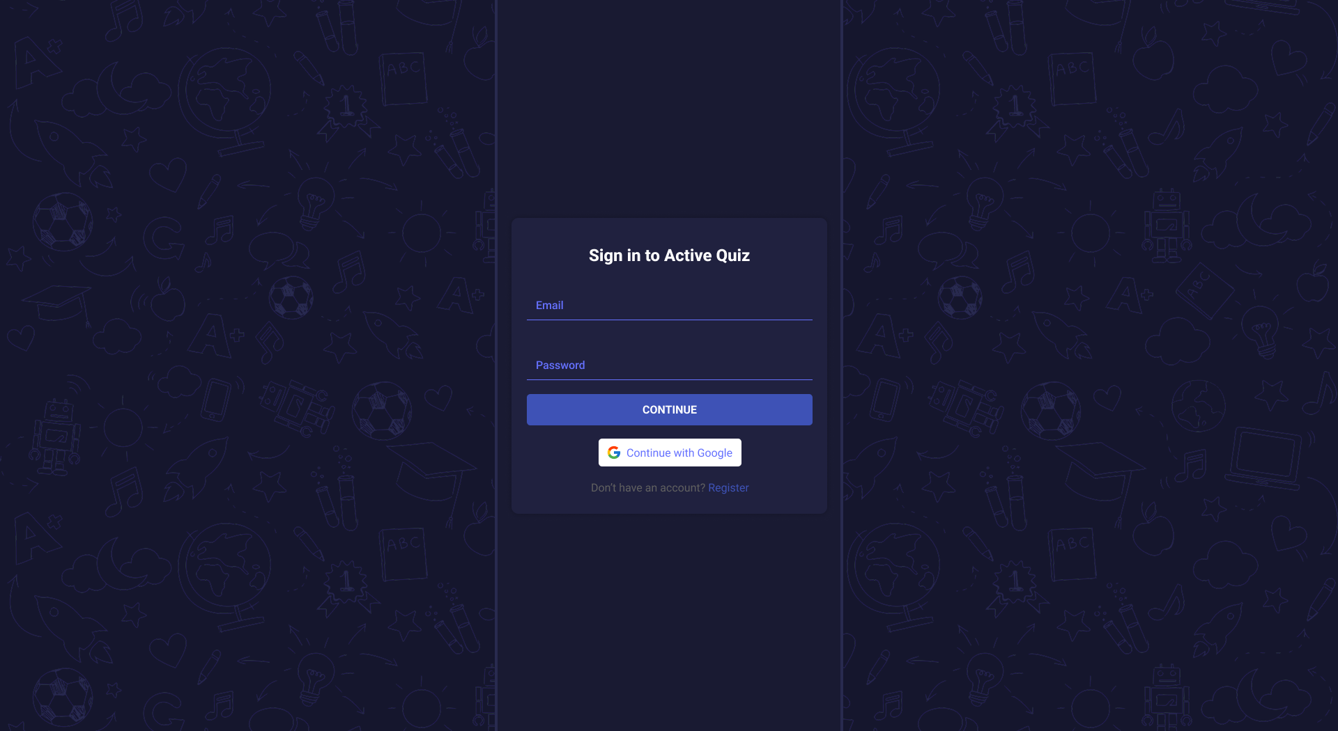
To begin managing the quiz-related changes and content management, we will need to log in as admin.
Login Screen Overview
Login Fields:
- Email: Enter your registered admin email address.
- Password: Type your secure password.
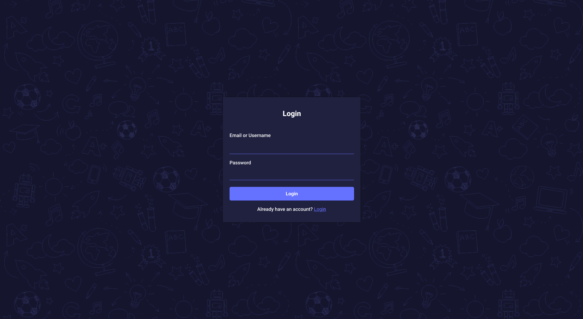
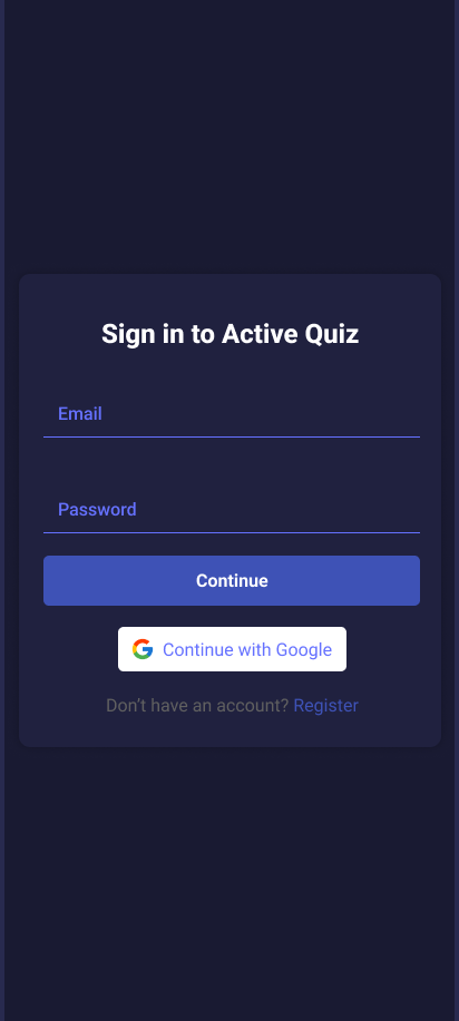
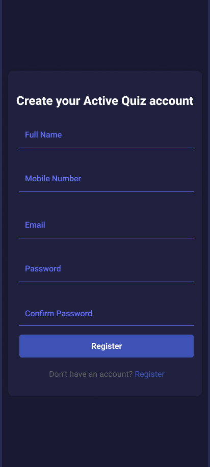
This image shows how the login screen will look like on the web.
MODULE 1: Admin Dashboard
The Dashboard Module provides an overview and quick access to various sections of the admin panel. It is designed to be user-friendly and intuitive, allowing administrators to efficiently manage different aspects of the platform.
Key Features:
- Category Management: Access and manage different categories available on the platform.
- Question Management: Create, edit, and organize questions for quizzes or contests.
- System Perks: Handles quiz-related questions, points, and quiz time.
- System Users: Manage user accounts, including adding, editing, and removing users.
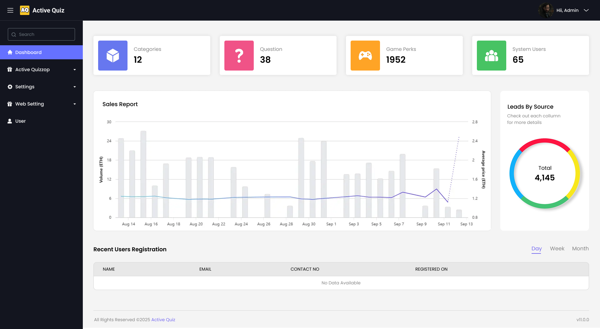
This image shows how the Admin Dashboard will look like on the web.
MODULE 2: Active Quiz
There are three sub-modules in Active Quiz as named below:
- Main categories
- View questions
- Import questions
Submodule 1: Main Categories (with AI-Powered Assistance)
Title:
The **"Add Quiz Category"** form allows admins to create new quiz categories for organizing quizzes. With AI integration, content suggestions such as name ideas, slugs, descriptions, and image hints can be generated to streamline category creation.
Form Fields (all fields are required):
- Name: A text input field to enter the name of the quiz category. AI Suggestion available: The system can auto-suggest catchy or trending category names based on quiz topics.
- Slug: A URL-friendly version of the name (lowercase, no spaces). AI Suggestion available: Auto-generates based on the category name.
- Priority: Defines the display order or importance of the category. AI Insight: Recommends priority based on category popularity trends.
- Prize: Entry fee or reward amount for quizzes in this category.
- Players: Defines expected player count or capacity per quiz.
- Image: Upload an image representing the quiz category. AI Feature: Recommends image types or pulls sample thumbnails from quiz context.
AI-Powered Enhancements:
Admins can click the “Generate with AI” button beside certain fields like Name, Slug, or Description. This uses AI to suggest context-aware values based on trends, previous data, or content intent.
Submit Button:
A blue “Create” button is located at the bottom. Upon clicking, the form submits the new category data and the AI-generated values (if used) are stored along with manual inputs.
Quiz Categories Table
This table lists all the quiz categories along with their relevant details. AI-backed analytics such as popularity or engagement predictions can optionally be shown beside each row.
- Image: Thumbnail representing the category.
- Name: Quiz category title.
- Slug: URL-friendly identifier.
- Priority: Display ordering indicator.
- Time Left: Time remaining for associated quizzes.
- Prize: Entry reward.
- Players: Number of participants so far.
- Actions: Buttons to view, edit, or delete the quiz category or its questions.
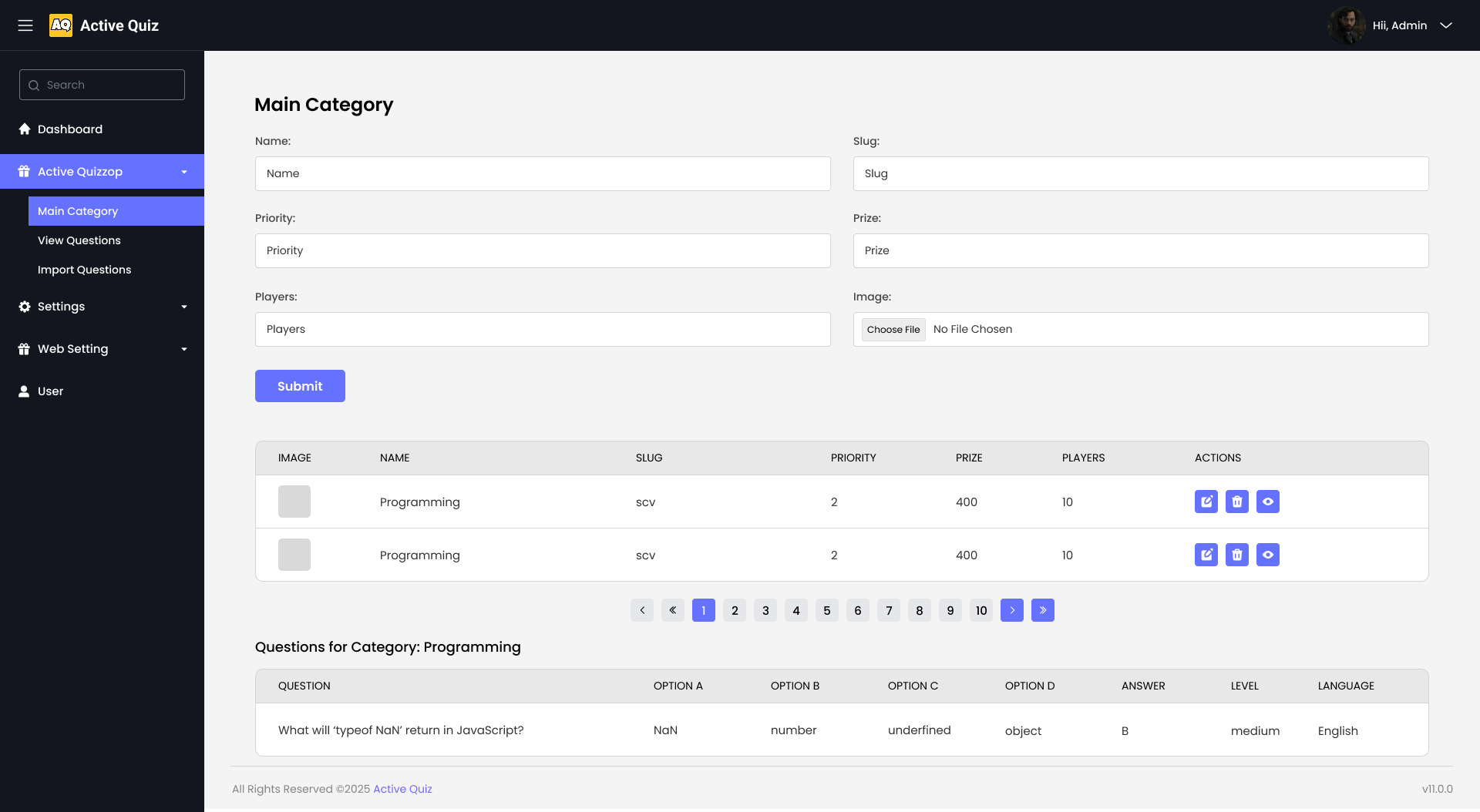
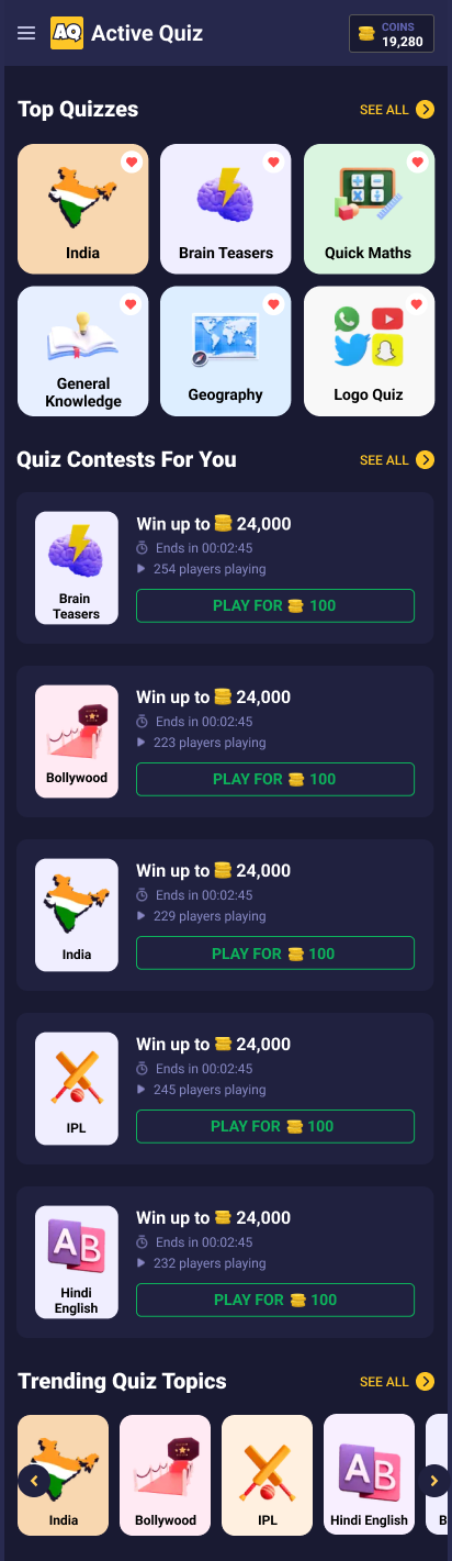
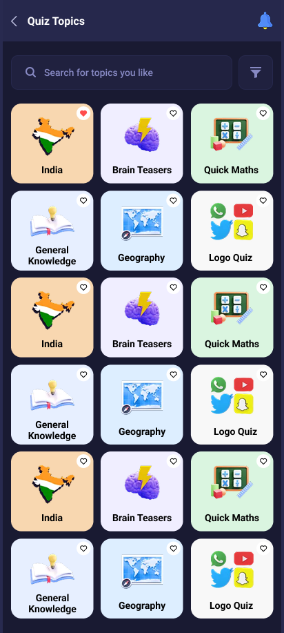
This image shows how the quiz categories are displayed on the frontend, enriched with AI-suggested labels and images.
Submodule 2: View Questions
View Questions Table
The "View Questions" table provides an overview of various quiz questions, including their options, correct answers, levels, main categories, and actions.
Table Structure:
- #: Serial number of the question.
- Question: Text of the quiz question.
- Option A: First option for the answer.
- Option B: Second option for the answer.
- Option C: Third option for the answer.
- Option D: Fourth option for the answer.
- Answer: Correct answer to the question.
- Level: Difficulty of the question (e.g., easy, medium, hard).
- Main Category: Origin category of the current question.
- Actions: Actions for each question (Edit, Delete).
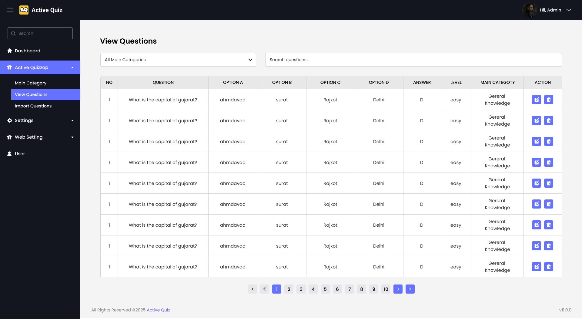
This image shows how the View Questions will look like on the web.
Submodule 3: Import Questions
AI-Powered Question Import Interface
The "Import Questions" module empowers administrators to efficiently add quiz content through either manual input or bulk CSV upload. This section is enhanced with AI capabilities that assist in auto-generating well-structured quiz questions, multiple choice options, and even suggested answers based on a given topic or keyword. The goal is to reduce manual work and ensure content consistency and quality across quizzes.
Tabs:
- Manual Entry: A form-based approach where users can enter one question at a time. This form is equipped with an AI assistant that suggests options and correct answers as the user types a question.
- CSV Upload: Enables administrators to bulk-upload questions using a standardized CSV format. The AI scans for incomplete or inconsistent data and suggests corrections before import (CSV section UI not shown in the image).
Manual Entry Fields (AI-Enhanced):
- Question: Text input where users enter the quiz question. AI assists by autocompleting or suggesting rephrased versions for clarity.
- Option A – D: Four input fields for multiple-choice answers. Based on the question context, the AI can suggest balanced options that include plausible distractors.
- Correct Answer: Dropdown to select the right answer. AI may pre-select the answer if it has high confidence in its suggestion.
- Select Level: Dropdown for selecting the difficulty (e.g., Easy, Medium, Hard). The AI can suggest a level based on question complexity.
- Select Main Category: Dropdown to associate the question with a quiz category. The AI suggests the best-fit category based on keywords in the question.
Add Question Button:
Clicking the "Add Question" button submits the form data to the system. In case of incomplete fields or logical inconsistencies (e.g., duplicated options), the AI prompts corrections before submission.
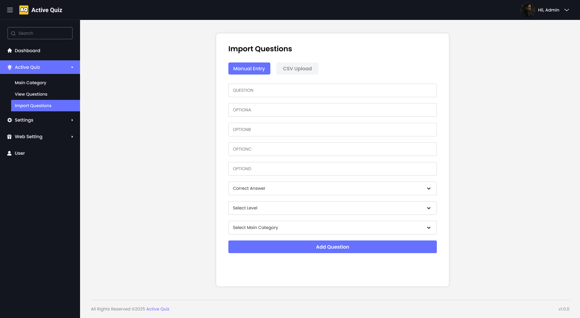
This image shows how the Import Questions section appears on the web with dual entry modes and AI support.
MODULE 3: Settings
There are several sub-modules in Settings as named below:
- Game perks
- Firebase settings
- About Us setting
- Contact Us setting
- Terms & Conditions setting
- Privacy Policy setting
Submodule 1: Game perks
System Utilities Settings
The "System Utilities Settings" panel allows administrators to configure various settings related to the quiz system.
Panel Structure:
- Title: System Utilities Settings
- Fields:
- Right Answers Points:
- Label: Enter right Answers Points
- Input Field: A text input field for entering the points awarded for correct answers.
- Wrong Answers Deduct:
- Label: Enter wrong Answers Deduct
- Input Field: A text input field for entering the points deducted for wrong answers.
- Time Left:
- Label: Enter time Left
- Input Field: A text input field for entering the time left for the quiz.
- Total Question:
- Label: Enter total Question
- Input Field: A text input field for entering the total number of questions in the quiz.
- Right Answers Points:
- Save Button: A purple "Save Settings" button to save the configured settings.
- Error Message: A message displayed below the save button indicating "Failed to fetch settings."
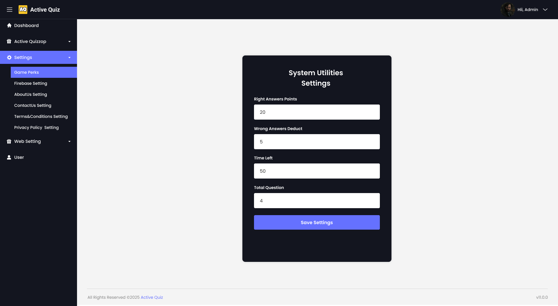
This image shows how the system utilities will look like on the web.
Submodule 2: Firebase Configuration
The "Firebase Configuration" panel allows administrators to set up Firebase Admin credentials for the system.
Panel Structure:
- Title: Firebase Configuration
- Description: Setup your Firebase Admin credentials here.
- File Upload:
- Label: Upload File
- Button: Choose File (Supports JSON files for Firebase)
- Instructions:
- Open your Firebase console and go to: Firebase Admin SDK Settings.
- Select your project.
- Click Generate New Private Key and confirm download.
- Upload the downloaded JSON file here.
- Save Button: A blue "Save Configuration" button to save the uploaded Firebase configuration.
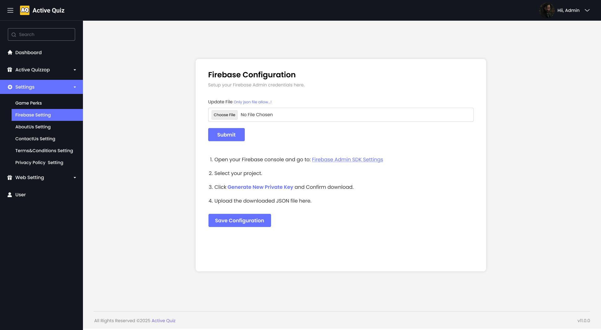
This image shows how the Firebase Config will look like on the web.
Submodule 3: About Us Setting
About Us Page Editor
The "About Us" panel allows administrators to configure the content shown on the About Us page of the platform.
Panel Structure:
- Title: About Us
- Fields:
- About Us Text:
- Label: Enter About Us Content
- Input Field: A textarea for entering descriptive text about the platform.
- About Us Text:
- Save Button: A blue "Save" button to store the About Us content.
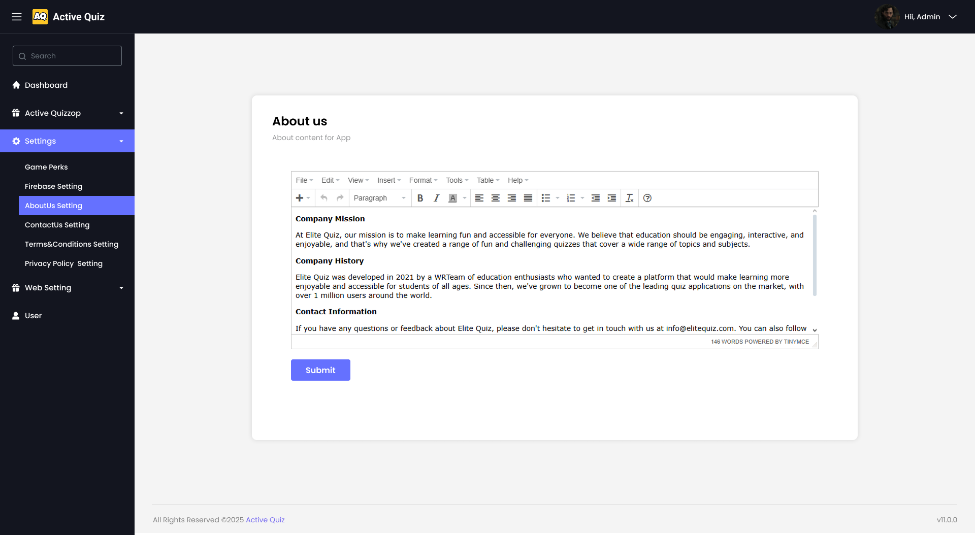
This image shows how the About Us section appears on the web. Other submodules of this module will contain the same UI and layout and will also do the same work as this.
MODULE 4: Web Settings
There are several sub-modules in Web Settings as named below:
- General setting
- Web ads setting
- About Us setting
- Notification sender
- Android & iOS ad setting
Submodule 1: General setting
Admin Panel - Manage Settings
The "Admin Panel - Manage Settings" allows administrators to manage various settings related to the platform.
Panel Structure:
- Title: Admin Panel - Manage Settings
- Fields:
- Text Color: Color picker for selecting the text color.
- Button Color: Color picker for selecting the button color.
- Font Size: Dropdown menu for selecting the font size.
- Font Family: Dropdown menu for selecting the font family.
- Header Logo: Button: Choose File - No file chosen
- Footer Logo: Button: Choose File - No file chosen
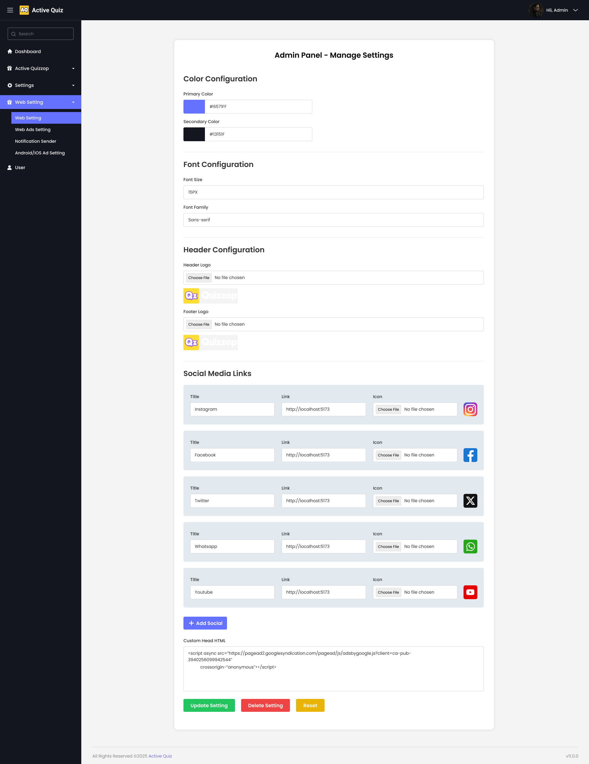
This image shows how the web ad configuration panel appears on the web.
Submodule 2: Web Ads Setting
Manage Ad Slots
The "Manage Ad Slots" panel allows administrators to configure and manage advertisement slots on the platform.
Panel Structure:
- Title: Manage Ad Slots
- Toggle: A switch to enable or disable all ad slots globally.
- Ad Slots:
- BANNERADS Ad:
- Ad Type: Dropdown to select the type of ad (e.g., BannerAd).
- Ad Code: Text input field to paste the ad code snippet.
- Save Button: A blue "Save" button to apply the ad configuration.
- IN-FEEDADS Ad:
- Ad Type: Dropdown to select the type of ad (e.g., InFeedAd).
- Ad Code: Text input field for the in-feed ad code.
- Save Button: A blue "Save" button for this ad configuration as well.
- BANNERADS Ad:
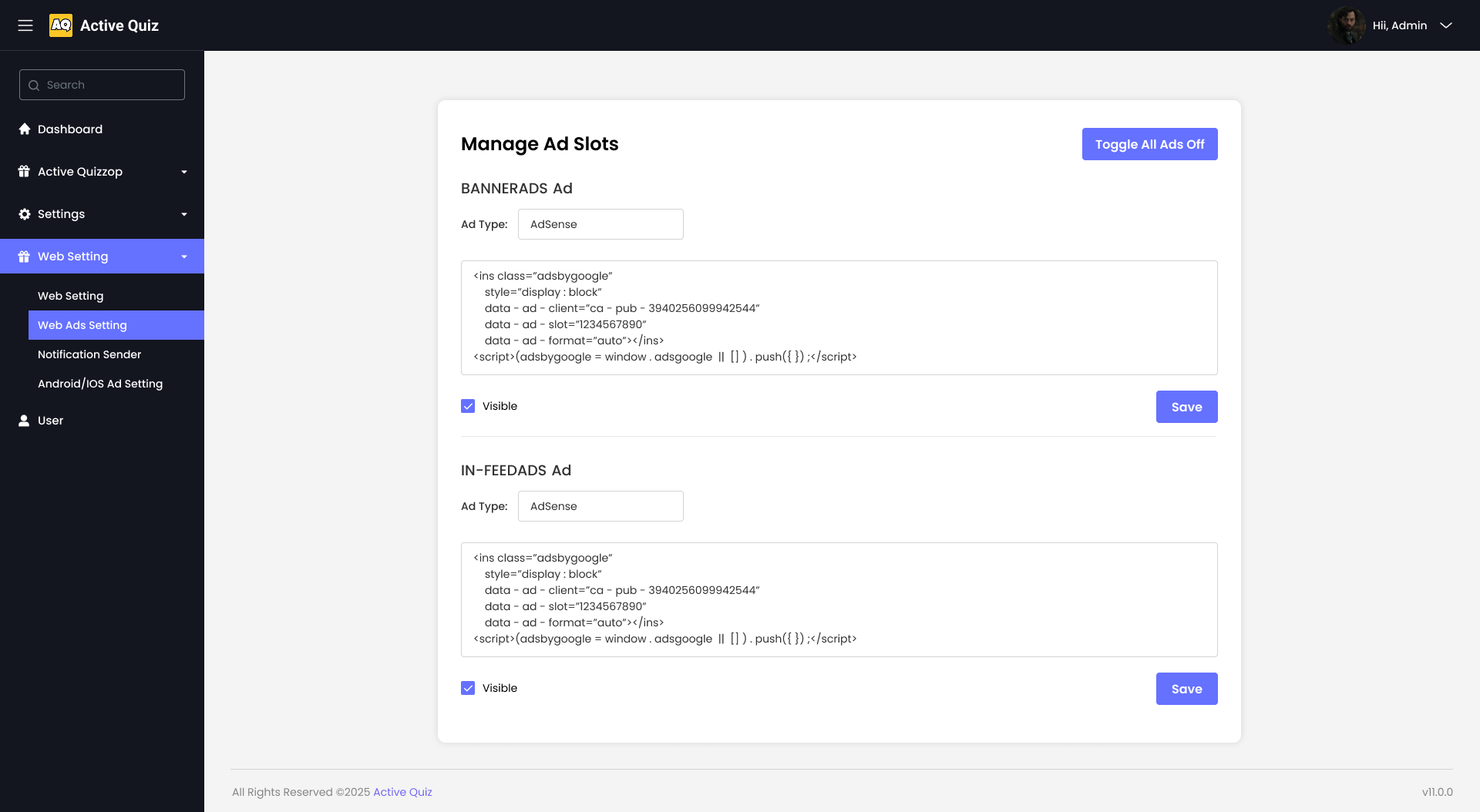
This image shows how the web ad configuration panel appears on the web.
Submodule 3: Notification Sender
Send Push Notification
The "Send Push Notification" panel allows administrators to send announcements or alerts to users.
Panel Structure:
- Title: Send Push Notification
- Fields:
- Title: Text input field to enter the title of the notification.
- Body: Text input field to write the content/message body.
- Send To: Dropdown menu to select target recipients (e.g., All Users).
- Send Button: A blue "Send Notification" button to deliver the message.
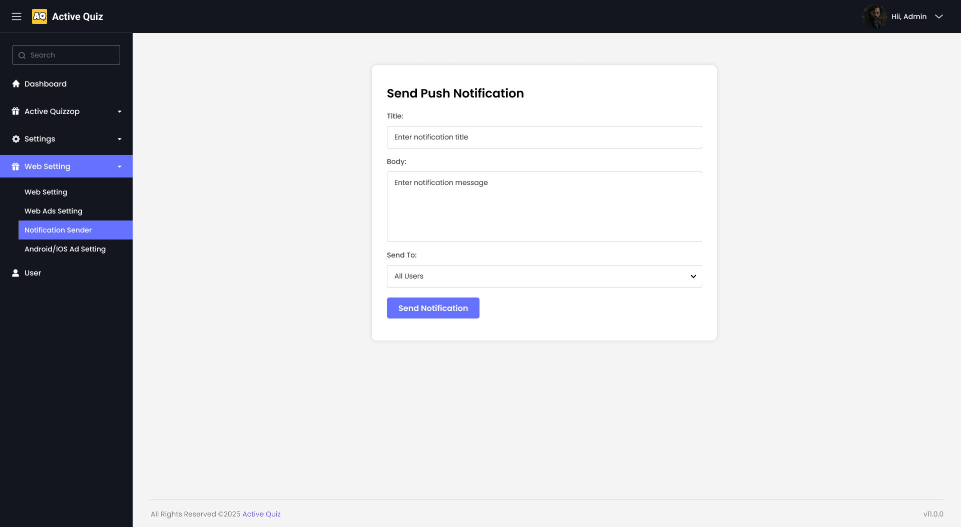
This image shows how the push notification panel appears on the web.
Submodule 4: Android & iOS Ad Setting
Ad Network Configuration
The "Ad Network Configuration" panel allows administrators to configure ad unit IDs for both Android and iOS platforms using AdMob or Unity Ads.
Panel Structure:
- Title: Ad Network Configuration
- Description: Separate ad unit IDs are required for each platform.
- Fields:
- Ad Type: Dropdown to select ad network (e.g., AdMob or Unity).
- Ad Unit IDs:
- Banner Ad: Text input field for AdMob banner ad unit ID.
- Interstitial Ad: Text input for interstitial ad unit ID.
- Rewarded Ad: Input for rewarded ad unit ID.
- Rewarded Interstitial Ad: Input for rewarded interstitial ad unit ID.
- App Open Ad: Input for app open ad unit ID.
- Unity ID (if using Unity Ads): Text input field for Unity ad ID.
- Save Button: A blue "Save Config" button to save the ad network settings.
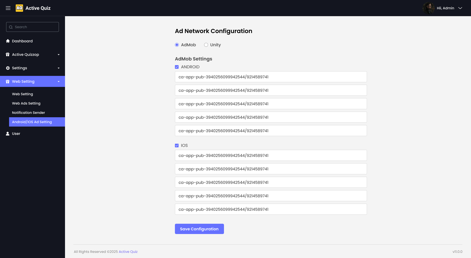
This image shows how the Android & iOS ad settings panel appears on the web.
MODULE 5: User
This module provides administrators with the ability to view and manage registered users on the platform.
The user listing displays essential information such as profile image, full name, registration date, and mobile number. It also includes action buttons to edit user details or update the user's status. This allows for efficient user control and management within the admin panel.
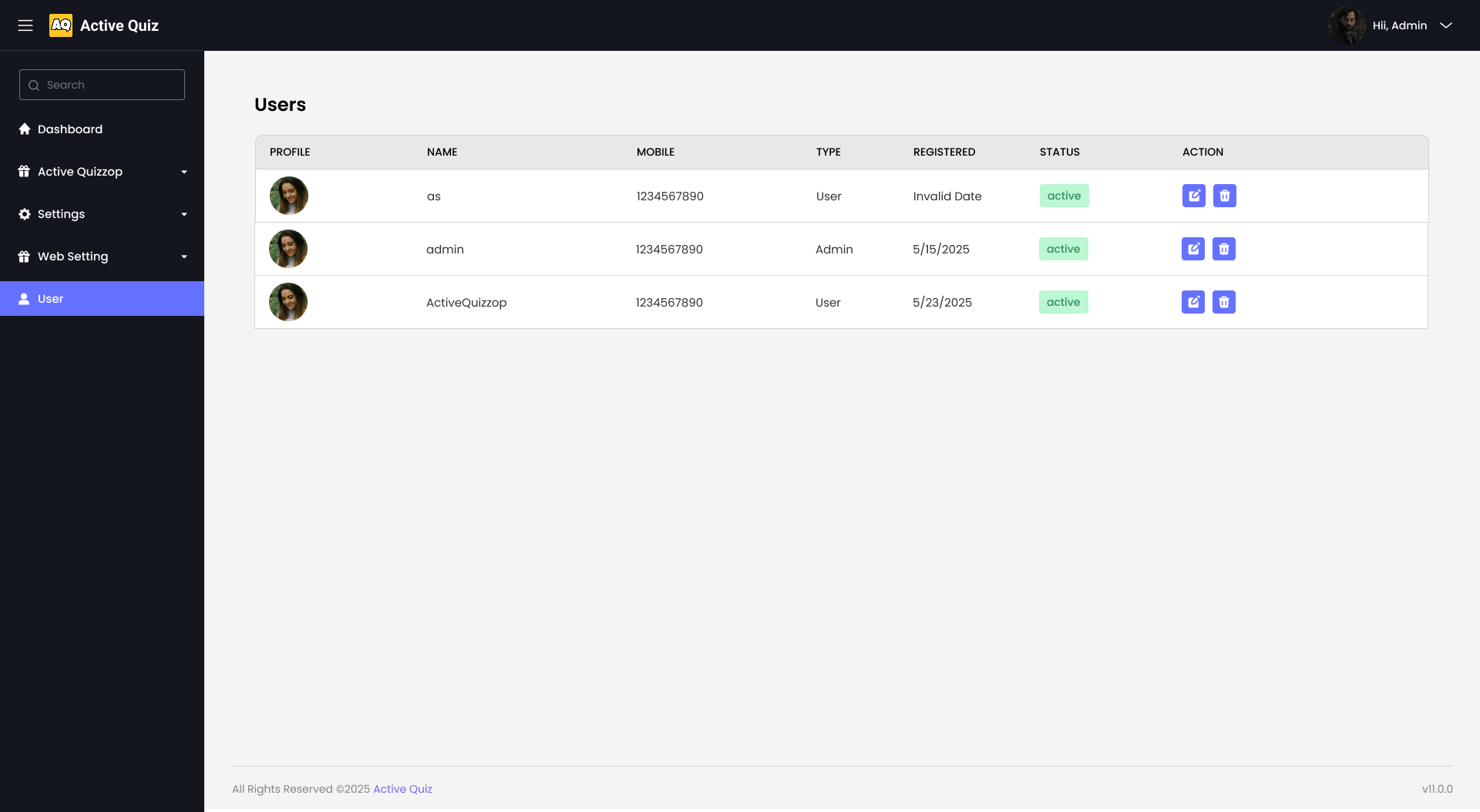
This image shows how the user list appears in the admin panel.
Version 1.0.1
MODULE 8: True-False Questions
The image shown below displays the "True-False Questions" section, which allows users to add and manage true-false questions.
- AI Prompt for generating questions
- Enter Question field
- True/False selection
- Difficulty Level selection
- Category selection
- Add Question button
Users can enter questions, select whether the answer is true or false, choose the difficulty level, and select a category for the question.

This image shows how the "True-False Questions" section will look in the app.
MODULE 9: Contest Rules
The image shown below displays the "Contest Rules" section, which provides users with detailed guidelines and rules for participating in quiz contests.
- Company Mission
- Company History
- Contact Information
Each rule is clearly outlined, covering aspects such as the mission, history, and contact information of the company.

This image shows how the "Contest Rules" section will look in the app.
MODULE 10: Payment Requests
The image shown below displays the "Payment Requests" section, which allows users to view and manage payment requests.
- Search functionality
- Select Status filter
- Submit button
- Payment Requests table with details
Users can search for specific requests, filter by status, and view detailed information about each payment request.

This image shows how the "Payment Requests" section will look in the app.
MODULE 11: Payment Request Details
The image shown below displays the "Payment Request Details" section, which allows users to view and edit the details of a payment request.
- Details section
- Status selection
- Close button
- Save Changes button
Users can view the details of a payment request, change the status, and save the changes.

This image shows how the "Payment Request Details" section will look in the app.
MODULE 12: Payment Settings
The image shown below displays the "Payment Settings" section, which allows users to configure settings related to payments.
- Enable/Disable Payment toggle
- Per Coin value
- Per Amount value
- Currency Symbol
- Minimum Coins for Request
- Difference in hours between consecutive payment requests
Users can enable or disable payments, set the value per coin and per amount, choose the currency symbol, and set minimum coins for a request and the time difference between consecutive payment requests.

This image shows how the "Payment Settings" section will look in the app.
MODULE 13: System Languages
The image shown below displays the "System Languages" section, which allows users to manage languages for the system.
- Admin Panel
- App Panel
- Web Panel
- Add Admin Language form
- Admin Language List
Users can add new languages for the admin, app, and web panels, and view the list of available languages.

This image shows how the "System Languages" section will look in the app.
MODULE 14: Edit Request
The image shown below displays the "Edit Request" section, which allows users to edit the details of a payment request.
- Status selection
- Close button
Users can edit the status of a payment request and close the edit view.

This image shows how the "Edit Request" section will look in the app.